
used with permission from Microsoft Office Blogs
by Jeffrey Johnson
Have you ever had a dataset but only needed to chart certain parts of it? Here are 4 methods for filtering your chart so you don€t have to edit or remove your data to get the perfect chart: hide data on the grid, table filtering, filtering using table slicers, and filtering directly from the chart.
Setting up the chart
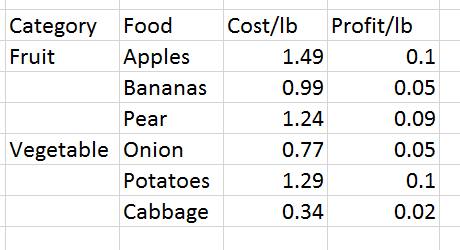
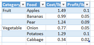
We€ll begin by charting a dataset. Let€s say we€re running a produce stand at a farmers market and want to understand our cost and profit on our sales.
To create the chart, select the range, then click the Quick Analysis tool. Now select Charts, and then click Clustered Column.
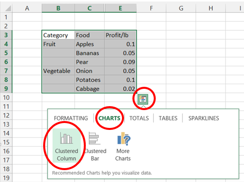
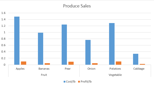
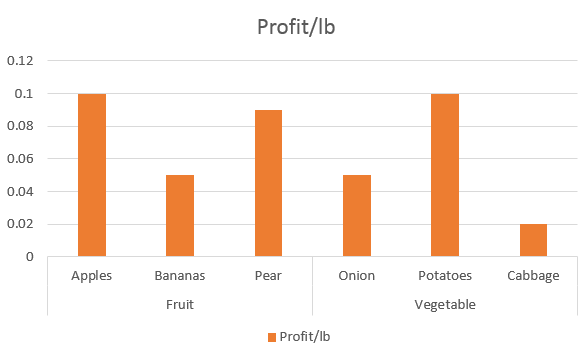
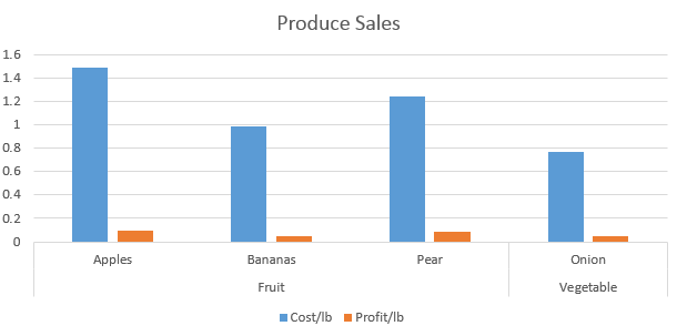
This gives us the following chart. Note: For this example, I added the chart title Produce Sales. You can add your own title by clicking on the chart title, which will allow you to edit the text.
Hide data on the grid
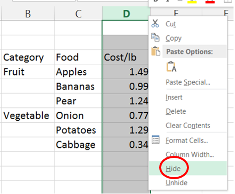
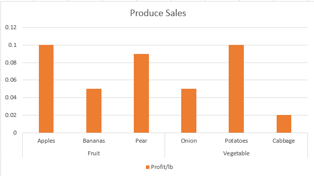
Now I want to completely remove Cost/lb from this chart to focus completely on the profit. I can hide the entire column and it will be reflected in the chart.
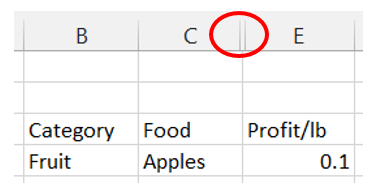
To hide the coulmn, right-click the column header containing Cost/lb and then select Hide.
The chart removes the series.
Notice the grid header hints the hidden column.
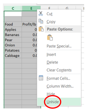
If you want to show the cost data again, unhide the column. To do this, select both columns C and E by clicking the C column header and dragging it to column E. Now right-click the highlighted columns, and then click Unhide. Note: You also can also unhide by holding left-click on the right edge of the hidden column header and dragging it to the right.
The series is now visible and on the chart once again.

Table filtering
If you want to filter out specific foods from your chart, you can turn your grid data into a table, which provides filtering for each row.
Select your data range, and then click the Quick Analysis tool. Select Tables, then click Table.
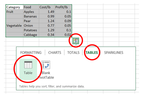
Tables allow you to easily format, sort, filter, add totals, and use formulas with your data.
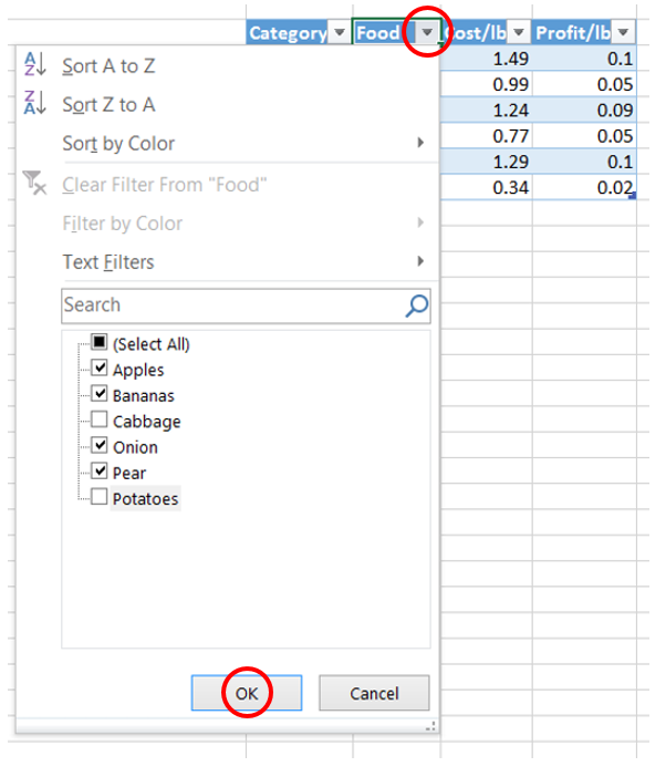
Now that we have a table, we€ll filter the out-of-season produce. To reveal the filter, click the down arrow next to Food. Uncheck the out-of-season items, then click OK.
The filter is applied to the chart.
Try exploring more filtering options by trying different combinations of filters, and be sure to give the search bar a try. This would be extremely useful if we had the whole produce section in our table.
Filtering using table slicers
Table slicers create a filtering experience with buttons as part of your worksheet. This allows you to easily click through your data to visualize different segments. For more information, check out this post that dives into the details of table slicers.
In this example, we€ll create a table slicer to compare specific produce costs and profits.
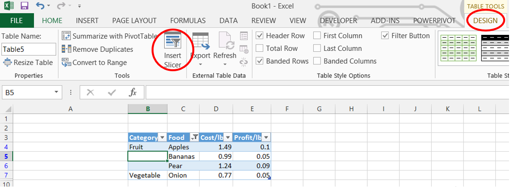
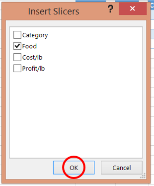
To create a slicer, first click anywhere inside the table. On the Ribbon, select the Table Tools Design tab. Click Insert Slicer, check the box next to Food, and then click OK.
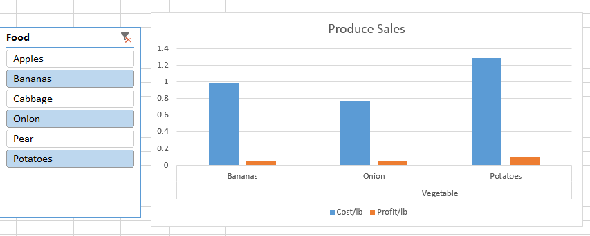
Now we have a slicer linked to both our table and our chart.
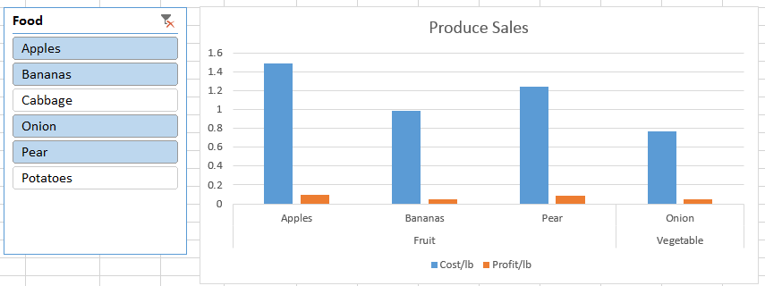
To filter, click an item under the Food heading and then see the chart and table update. To select multiple foods, hold down the Ctrl key and then click your desired items.
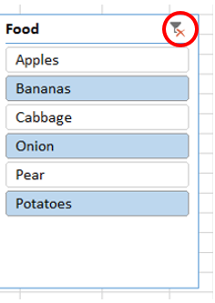
To clear the filters, click the Clear Filter icon.
Filtering directly from the chart
So far, all of the options we€ve looked at hide the data directly from the worksheet. But sometimes you have multiple charts to filter that are based on the same range or table. The on-object chart controls in Excel allow you to quickly filter out data at the chart level, and filtering data here will only affect the chart€not the data.
Select the chart, then click the Filter icon to expose the filter pane.
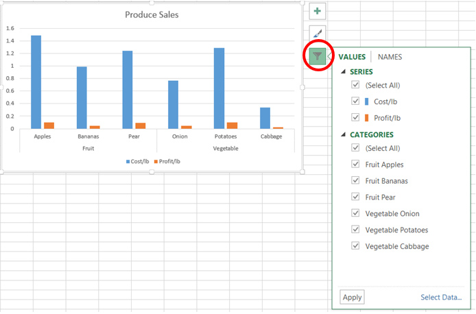
From here, you can filter both series and categories directly in the chart. For example, hover over Fruit Pear and see how the category is highlighted.
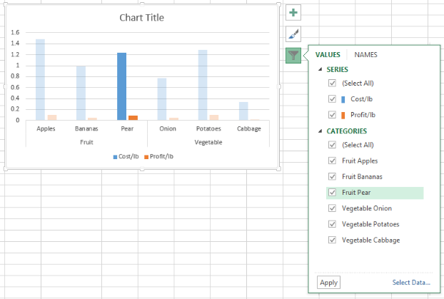
To get the same view we created in our earlier chart, we€ll hide the Cost/lb column.
Under Series, uncheck Cost/lb, and then click Apply. The chart reflects your changes.
More filtering capabilities
The new Excel brings powerful ways to visualize and interact with your data. For more advanced filtering capabilities, check out PivotCharts which enable you to aggregate, filter, and pivot with ease.